
 By far, the most popular thing I have ever written is Why You Need a Wide-Margin Bible, which accounts for something like half of all of the hits to this blog since I wrote it some three years ago. I wrote a sequel series on how to use a wide-margin Bible, but it never even came close in comparison–probably because, as I often do, I overthought things.
As I’ve mentioned before, I’ve used Zondervan’s Wide Margin NASB for some seven years now. Though there were a few things I would’ve done differently, like add cross references for at least direct quotations, I’ve been very pleased with it, and thanks to my handy leather case, it has held up remarkably well over the years despite the fact that I’ve carried it with me almost perpetually.
But all good things come to an end, and every sword eventually wears down with use and must be replaced if it is to do its job in battle. And so, with a certain wistfulness, I’ve decided that it’s time to replace my Bible.
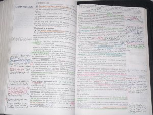
It’s not that it’s falling apart or anything like that. It’s worn, but in good enough condition that I could probably get it rebound if I wanted to. No, the problem is simply that I’ve filled it up. That’s not to say that every page’s margins are covered with notes from top-to-bottom. Many pages have only a few notes. But there are other well-worn paths that are completely filled in, like Genesis, Galatians, or (of course) Revelation.
It’s not just that I’m out of space to write notes in some places. It’s that when I go to read or study those areas, I’m not really seeing the text anymore–I’m seeing my highlights and notes. It’s causing my Bible study life to stagnate, so it’s time to start fresh.
Unfortunately, there’s not a lot of choice out there in the wide-margin world. Oh, if you want to spend a couple hundred bucks, you can get one of Cambridge’s, and there’s a reasonable selection for the KJV. But there’s a bit less choice in the medium-price, modern translation world. (And pretty much nothing for us Messianics.)
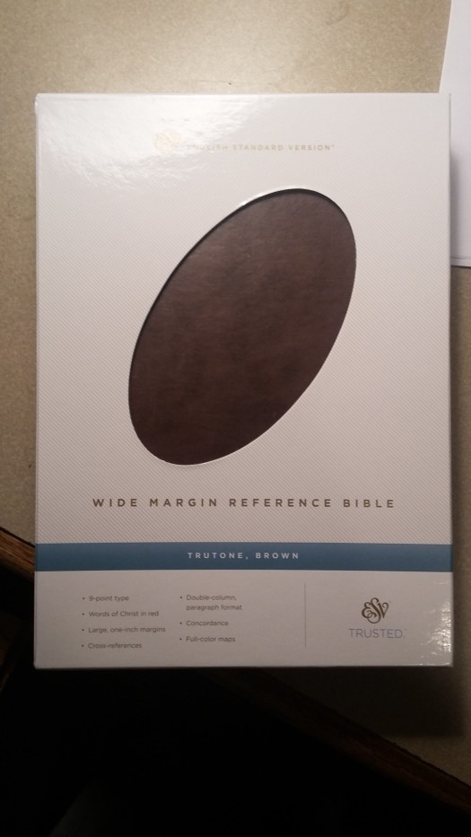
After reading quite a few reviews, including this one on YouTube, I finally settled on the ESV Wide-Margin Reference Bible in the TruTone cover. It finally arrived today, so here’s my initial review.
First, I actually like the TruTone cover. I’m told it doesn’t wear as well as real leather, but I’ve not had a problem with any of the other TruTones in the house and intend to keep it in my old leather cover when travelling with it anyway. It’s a good, flexible, attractive cover that can even perform “Bible-yoga”–albeit not as tightly as your “top grain” leathers:


I took just a few minutes to stretch out the stitched binding with my fingers, and now it lays flat on every page, from start to finish.
Structurally, it’s interesting to compare to my old Zondervan. The ESV is the same dimensions height and width-wise, but a good quarter-inch thinner:


Despite this, it actually has more practical writing space:
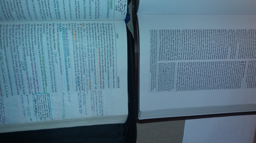
You can see that while the Zondervan has a slightly larger outer margin, the ESV has both an outer and an inner margin with double columns, so you can more easily make sure your note fits right next to the verse. The ESV also has a full set of cross-references and the occasional textual footnote:


The trade-off is a slightly smaller font size (9 pt vs 9.5) and setting everything in paragraphs, which means you don’t have that little bit of space after most verses. If the paper is thinner, I can’t tell from the feel. However, the font itself is very nice and easy to read at 9 points, even for my less-than-optimal vision, and the paragraphs definitely make for a smoother reading experience. The font on the cross references is truly tiny (I’m guessing a 6 point font), but that’s not much worse than you would find for the cross-references in many study Bibles.
On the whole, it’s an excellent bargain at $35-45. If I keep it long enough that the cover really starts to wear, it looks like it will lend itself to rebinding pretty well. The only downside is that there aren’t any spare pages in the back, but that’s a minor gripe.
I’ve been giving a lot of thought as to what I plan to do differently in my marking scheme this time around. The first rule I’m going to (try to) follow is pretty simple: No highlighting. While my highlighting scheme in my previous Bibles was wonderful for being able to quickly locate passages later, it did tend to prejudice my thinking on further read-throughs. For example, I used purple to underline Messianic prophecies in the Tanakh (OT)–but many of those prophecies also have fulfillments nearer to the time of the original prophet, which I might overlook if I’ve already “flagged” them differently. Ditto highlighting eschatological prophecies in yellow.
I’ve picked up a set of Pigma micron pens to start the process (doubtless I’ll succumb to the temptation to use a ball-point eventually, but . . .). My planned scheme is black for general notes, blue for linguistic notes, green for historical notes or quotes from non-canonical sources, and red for translation errors, variant readings, and miscellaneous markups (e.g., counting how many times a key word appears in a particular passage). Rather than do my own cross-references in green, as I did before, I will note them in the color that the rest of the note is in.
I’d meant to add some philosophical musings on “listening to the text” of Scripture, but I find that this post is already hitting almost a thousand words, so I’ll save that for later. For now, I’m off to start reading my new Bible and add my first notes to it.
Shalom!
